Do you have a big presentation coming up for school, work, or a special event? Want to make it one to remember?
While almost anyone can pretty easily throw together a presentation these days thanks to all of the great tools out there — Canva is our personal favorite — making a truly great one that doesn’t bore your audience is another story.
If you’re like most people giving a presentation, your slides are really more like notes. You use them to guide the presentation you’re giving.
This doesn’t make them exciting to the viewer.
Instead, it’s likely they have the opposite effect.
It doesn’t have to be that way, though.
You can create dazzling slides that help elevate your presentation and wow whatever crowd you’re in front of.
In the guide below, we’ll go over some tried and true tips to make sure your presentation stands out from the rest.
Disclosure: Some of the links in this article are affiliate links, meaning at no additional cost for you, we might get a commission if you click the link and purchase.
Choose the Right Presentation Software
[lasso id=”18090″ link_id=”46360″ ref=”canva-pro”]
Using the right presentation software can make a huge difference in how your presentation looks and feels.
It wasn’t too long ago that the only real presentation software out there was Microsoft PowerPoint. While that’s still one of the leaders in the industry, there are several other free and paid options that are now available, and in some cases, these tools are even better than what PowerPoint offers.
Our personal favorite tool for creating presentations is Canva.
Canva makes it fast and easy for anyone to design just about anything, including slideshow presentations.
There are tons of pre-made templates to choose from, and you can customize them easily with just a few clicks.
Canva’s drag-and-drop interface is super easy to use, making it simple for anyone to create beautiful slideshows, no matter their level of design experience.
The first thing you need to do is to create a Canva account. This will let you create and save your projects.
While it’s totally free to create a Canva account and use the platform, an upgraded Canva Pro account lets you access unlimited features, way more templates, and premium content to take your designs to the next level.
Once you’ve created and logged in to your Canva account, you can start creating a presentation.
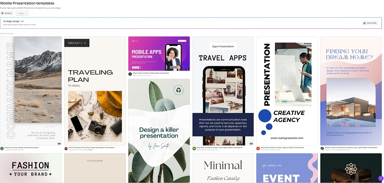
Start by searching for “presentation” in the search bar at the top of the page. You’ll be presented with a ton of pre-made templates that you can customize with text, photos, icons, and illustrations.
Click here to get started with designing your presentation on Canva.
Add Videos
When using Canva to create your presentation, you will have access to plenty of interactive elements.
One of those elements is video.
This simple addition will captivate your audience in a way that only adding text will not. You might decide to add a video that offers a walkthrough of a concept that you’re teaching or something funny, but relevant to your topic to break the ice.
Depending on your presentation software, you’ll just click a button to add the video and once it’s on a slide you’ll be able to manipulate it, making it as small or as big as you need.
Layer Text
Do you get excited when you see a presentation that has a white background and some standard text with nothing else?
Neither does anyone else.
A quick and easy thing you can do is layer your text to give your slides some dimension. To do this create a text box with your initial text and then place additional text or images on top.
For example, if you have an associated hashtag that is relevant to your presentation, you might have that covering the initial background. On top of that text, you might have a photo or video.
The goal when you do this is to make sure the text on the bottom layer is easy to read with a font that stands out and a color that makes the background pop.
Think About Mobile Access
The world is changing and while most of us used to give presentations in class or in a boardroom, these days they can take place from anywhere and happen with a remote audience. And since that is the new normal, it’s important to consider how your audience will be viewing your presentation.
You can have a beautiful presentation that’s optimized for the computer, but if you’re not considering mobile viewing, you’re condemning half of your audience (or more) to a potentially terrible presentation.
Optimizing for mobile just means that you make sure that your presentation can be viewed vertically on a smaller screen.
As the screens are smaller, you want to ensure that the text is bold and large enough to read in a font that stands out.
If you feel like this is more technical knowledge than you have, don’t worry. There are thousands of presentation templates out there that are already optimized for mobile, so all you’ll need to do is just input your information into them and you’ll be good to go. You can find these templates on services like Canva.
Make It Interactive
If you want your audience to be excited and engaged, you actually need to give them something to be excited and engaged about.
One of the easiest ways to do this is to add interactive portions to your presentation. Get the audience talking and taking part and they will be less likely to fall asleep during your presentation!
There are so many different ways that you can do this.
When you’re crafting your presentation, you should think of it as a conversation between you and the audience. Give them a chance to ask and/or answer questions in the moment.
If your presentation is live, you can get a good conversation going and that interactivity will allow the audience to learn more about your presentation than they would have otherwise.
For example, maybe your presentation is on productivity. One of your opening slides could pose a question to the audience. This question could have multiple options in text bubbles on the slide, not only allowing for interactivity, but using some shapes to keep the slide interesting.
As you give the audience options to your question that will create a dialogue. This is especially helpful if you’re not a big public speaker. Having an audience to interact with will often be something that can keep you on track and at ease.
If your presentation is not live, you can still suggest that the viewers leave you comments and feedback in the appropriate areas to further the conversation.
Either way, the goal is to engage the audience and make them interested in your presentation. Interactivity is a great way to do that.
Use Animation
Beyond videos, you can add some in-slide or even transitional elements that keep things interesting.
One thing you could do is use some of the other tips listed here like layering text or images and then have an animated image or video on top of it. This puts the attention on the animation but also provides visual stimulation and can further your message with the underlying levels of the slide.
You can also use slide transitions. You probably already know what these are because it’s likely you’ve seen them in other presentations. As a slide gives way to the next slide, a transition could have your page explode or cave in or pop out in different designs, moving one slide to the next. You can do the same transition for each slide or if you want, you can mix things up and use different transitions.
Canva makes it super easy to add both animated elements and transitions to your slides.
Create Appropriate Images to Convey Complex Information
Whether this is an educational presentation for class or you’re trying to communicate a complex solution in a work presentation, images can be your friend.
We talked about images a little bit in the sections above, but there’s more to think about.
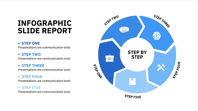
If your presentation has complex ideas, graphs, pie charts, and even infographics can be a great way to make a difficult-to-understand concept more palatable.
Information can have a way of going into and out of your audience’s ears, but a prominent graphic taking up the screen can be easier to understand. It offers a way for the audience to remember some key points of your presentation.
Similarly, if you were discussing changes to your company, you might have a timeline graphic that shows where you are now and where you plan to be in 3-months, 6-months, a year, and even five years.
These images can help break down complex thought processes, which is important, because there’s nothing worse than losing your audience during a presentation.
You can find templates that allow you to use graphs that you can edit to suit your needs, or you can make your own graphs in Canva.
Add Color & Shapes
If you only add text to your presentation, it’s going to appear as a flat background that’s about as exciting as a piece of paper.
No matter how good your speech might be, no one will care about your actual presentation because they aren’t visually stimulated. The actual presentation might as well be part of the wallpaper.
You can change this by utilizing color and shapes.
For starters, choose an overall color theme for your slides.
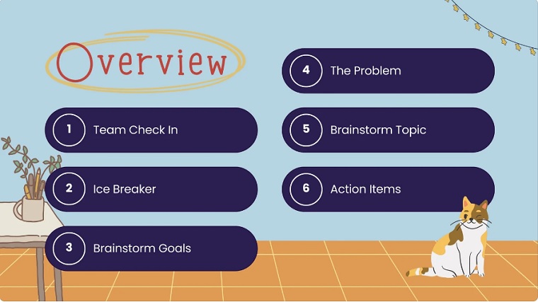
For this example, let’s say you choose Blue. Your entire slide is blue. Now create a header box for some text. That box is going to be white, and the text is purple. Now there’s an image to the left with its own coloring and to the right is another text box, in white, with dark pink bullet points.
You can change the colors to whatever suits you, but the idea is that with all of these shapes and colors, the viewer is greeted with something aesthetically pleasing and interesting as opposed to the same old text they might see on one of their screens.
Final Thoughts
A great presentation can help you communicate even the most complex of ideas in an interesting, engaging way.
With the right content and formatting, you can create a presentation that captures your audience’s attention and makes them remember your message.
Canva makes it easy to take your presentations to the next level with all of their templates, tools, and features, so you can take your presentation from good to great.
Click here to try Canva Pro for free today.
[lasso id=”18090″ link_id=”46361″ ref=”canva-pro”]
Have any questions about how to improve your presentations? Let us know by commenting below.
- Xero Cloud Accounting: Is It Worth It? (2026 Update) - 01/20/2026
- QuickBooks Promo Code UK - 12/15/2025
- Great Learning vs Coursera: Which Platform Delivers Better Outcomes for Learners? - 10/15/2025


