As an instructional designer, I know the importance of creating courses and lessons that are conducive to the learning needs of each particular audience. Many of today’s learners are often learning on the go and need an approach that meets those needs. That’s where mobile learning enters the picture.
While thinking about the best practices used in curriculum development and instructional design for mobile learning applications, we have to think about the most interactive and engaging ways to present content to ensure we get the outcomes we want.
In the guide below, I’m going to share some of the tips I’ve picked up over the years for designing eLearning experiences that resonate with mobile learners.

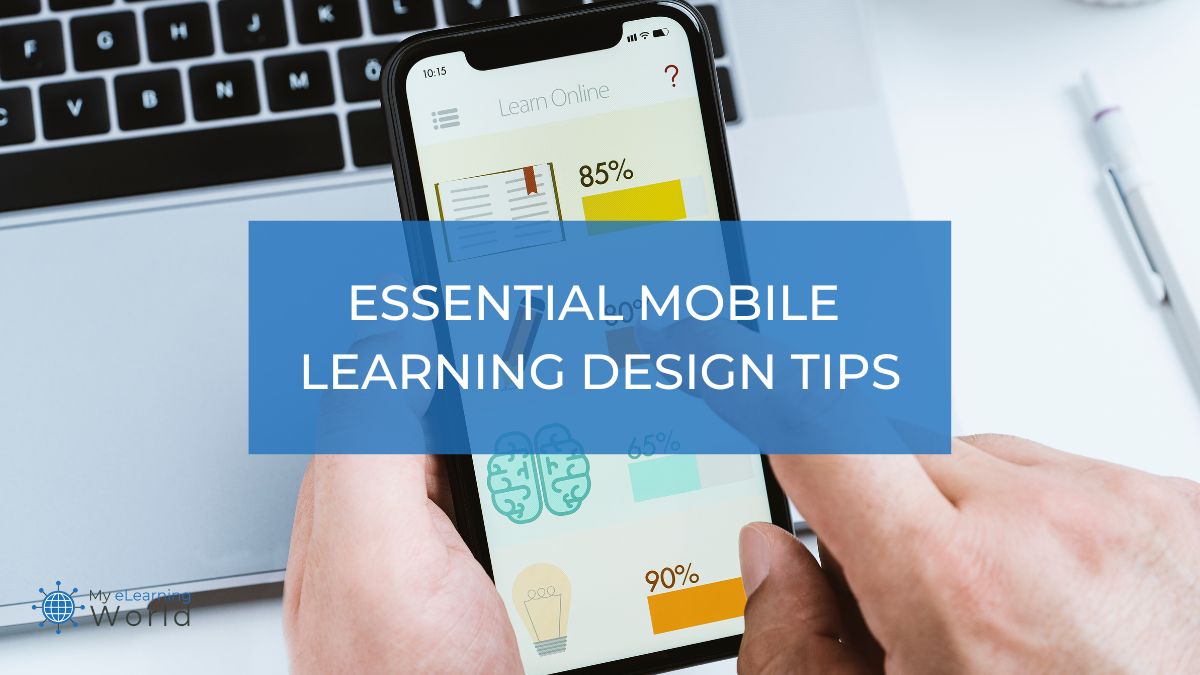
Tips for Creating Effective Mobile Learning Content
1. Keep Formatting Simple
One helpful tip for creating mobile friendly eLearning content is to utilize formatting to your benefit. Because these learners will be using a smaller screen than your typical laptop, it’s important to save space and keep it simple.
Here are some of the formatting tips I use:
- Consider using lists or bullet points to help convey meaning and present new content.
- Remember that when using images or videos, include it in the best format for mobile devices, as these things may take longer to open on a mobile device with less internet signal or connection.
- If possible, enlarge buttons and clickable items to help learners easily tap these items.
- Because they are using their own fingers on a smaller screen, the lack of the use of a mouse is something to keep in mind as well. It is easier to navigate a larger screen and a mouse gives more control.
Keeping the format as simplified and clean as possible will also help improve speed and provide a better learning experience for the mobile learner.
2. Make It Easy to Find Content Fast
Because many mobile learners are limited on time and accessibility, I like to include a search option. This allows mobile learners the ability to search for specific content if they need to refresh or review concepts, vocabulary, or to help them find answers to their own questions.
Keep the search tool simple and easy to use.
In fact, all navigation options should be simple and easy to use. I find that using a drop down menu on the side of the screens to compile the navigation options. This helps with accessibility and formatting, as well as navigation.
This is also helpful in reducing the amount of scrolling that is needed to navigate the course.
As much as possible, you want to limit the need for mobile learners to scroll. Presenting as much content on the screen at a time is a helpful way to keep learners engaged. As the need to scroll arises, the opportunity to become distracted also arises. Make every effort to keep your learners engaged.
3. Offer Offline Access
As mobile learners move in and out of areas, they may suffer loss of connection in the process. Because of this, you may want to consider allowing for content to be accessed in an offline fashion. You can allow for any content that has been downloaded to still be accessible, even if the loss of internet connection occurs.


As with any other learning sequences and events, be sure to test well before presenting this to your mobile learners. By properly testing the course and individual lessons and modules, you can gain insight for anything that does work well with the mobile format and navigation.
4. Keep Lessons Short and Focused
Consider the fact that many people utilize mobile learning when they are on the go. Think about the mom waiting at her child’s sports practice or the dad who is getting his car’s oil changed.
They may only have short snippets of time to devote to learning new content, so it’s important that it is designed for these learners to meet their specific needs.
Use microlearning principles and shoot for small chunks of time that can allow for learning to occur within no more than 15 minutes. The content must be meaningful and engaging, hooking the learner in for the next section of content when they log back in.
I find it helpful to break down learning objectives into simpler strands or to focus on only one objective at a time.
When I stick with one objective at a time, I find it easier to keep it simple by only providing the necessary information. It eliminates adding in extra information or trying to find ways to connect content from other areas.
5. Use Images and Other Visual Aids
Consider cutting down the amount of text and instead adding in more images, infographics, and visual learning supports. I’ve found that this can make the content more engaging and easier to digest, breaking up text-heavy content and making it less daunting and more appealing for learners on the go.
In my experience, complex ideas or data can be simplified and conveyed more effectively through visuals. Infographics, for instance, can distill intricate information into an easy-to-understand format, aiding in quicker comprehension and retention.
Visual aids cater to visual learners who grasp information better through images, charts, and diagrams. This approach supports diverse learning styles, ensuring that the content is accessible and beneficial to a wider audience.
When designing your visuals, make sure they’re optimized for mobile viewing. You want to consider the size, resolution, and orientation of images to ensure they are clear and legible on smaller screens.
Avoid clutter and ensure that visuals are responsive, adapting seamlessly to different device sizes.
6. Reduce Distractions
As with best practice of designing learning in any format, try to avoid embedding hyperlinks to take learners outside your learning management system to a different website.
Our goal is to bring the learning to them, not direct them away. This often leads to distraction and delays in completing learning tasks for all learners, but could also add frustration to mobile learners because of the struggle to navigate this on their mobile devices.
7. Make Accessibility a Priority
Making it accessible is another key element to designing effective eLearning content for mobile users.
While some learners may be able to put in some headphones or earbuds and listen as they learn, others may not have that option. Because of this, I find that adding in subtitles is a great way to bridge the gap for those learners.
Keep in mind that each mobile user will have different needs and could have different accessibility options, so give them the options to activate or choose not to use the sound and subtitles.
8. Streamline Your Assessments
Like all other forms of teaching and learning, we must find creative and effective ways to assess eLearning as well.
For this type of assessment, you will want to keep in mind that it should also be simple and short. Don’t overcomplicate it with additional wording or actions.
Because of the format and navigation of mobile eLearning, multiple choice and short answer options will be good choices for your learners. You could even consider matching or drag and drop answers, as well as drop down answers choices. Our guide to quiz formats can help you find the right assessment style for your course.
Because you want the assessment to provide value to your learners, it’s a good idea to provide immediate feedback for the assessment. Allowing your learners to see the correct answers on demand will help correct misunderstandings.
9. Get Feedback from Learners
As with creating any learning experiences, it’s important to include a process of getting feedback from your learner. It’s incredibly helpful to seek feedback that will speak to the ease of navigation, the amount of content and how it’s presented, and the format of the content.
You may also find benefit in gathering feedback about engagement and the time length of each section.
Sample questions could include:
- Was the amount of estimated time to complete each section accurate?
- Were the lessons presented in a reasonable amount of time so that one lesson could be finished in one sitting?
- Rate your engagement with the course/lessons on a scale of 1-10.
- Was the content easy to navigate and access?
Consider adding an open ended section for comments, so that users have the opportunity to share their thoughts with you, possibly sparking more ideas to use. This will be vital information to use as you update your course and grow future courses.
Final Thoughts
The more thoughtful you are in the development process of your mobile learning content, the more purposeful and beneficial the process will be for your learners.
As you work to tie all the pieces together, just remember that your audience needs you to make it as simplified and easily navigable as possible.
Adhering to these tips and other best practices of instructional design and development, you are ready to provide impactful, purposeful and meaningful learners to your unique audiences.
Have any other questions about mobile learning? Leave a comment below so I can help you out.
Honored to be a Red Mountain Writing Project fellow, Brittney has pursued her love of writing by specializing in the field of education. She is an experienced writer and presenter to learners of all ages.