If you’ve created a course to sell online, the way you market it will make all the difference in whether or not your efforts will pay off. You need your online course to appeal to the audience you’re seeking. In other words, you’ve got to reach who you want to teach.
If no one can find your course, it won’t matter how much you know or how talented you are in your field.
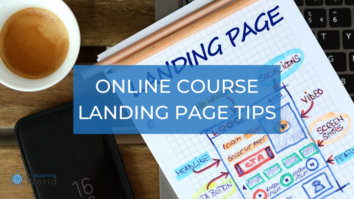
One of the best ways to market your course is by creating a landing page for it. If you’re not sure what a landing page is or how to design a good one, never fear. I will walk you through it step-by-step and point you in the right direction for landing page success.

What is a Landing Page?
A landing page is much what it sounds like: it’s where a visitor to your site lands when they want to learn about what you’re offering.
Your course’s landing page is where you paint a picture of what it is you’re providing to your prospective students and hopefully get them to buy.
This is the place to draw your audience in and turn them from visitors to clients.
You’ll want your landing page to really show what your course is about and why it’s a good value, especially compared to your competition.
Your landing page needs to be attractive and eye-catching. Bold headlines, a pleasing color scheme, and enticing videos and images are all part of creating a great page.
You’ll also want to provide persuasive information and positive testimonials to help your audience understand why they should invest in your course.
And of course, your landing page needs to include a CTA, or Call To Action – this is the actual crux of the page.
Your CTA may be a button to sign up for a course, join a waiting-list, start a free trial, or enroll in your online school’s newsletter.
Whatever the goal, your CTA is the way you’ll actually grow your database and follow up with interested clients.


It’s important to curate each element of your landing page to attract as many compatible clients as possible.
Most web visitors only spend a few seconds on a site before they make their first impression, so it’s important to make your landing page pop!
What is the Easiest Way to Make Your Landing Page Pop?
If you’re not an experienced web designer or marketing pro, you may be worried about how to tackle your course’s landing page.
Thankfully, there are plenty of programs available to help you streamline the process.
Of the dozens of options available, I found Squarespace to be the most intuitive, reasonably priced, and effective design program for creating compelling landing pages.
The Squarespace platform takes care of all the tedious elements of web design and page building, so you can just focus on letting your course shine. Take it from someone who isn’t a designer, Squarespace makes it incredibly easy for anybody to make a landing page.
To create a landing page with Squarespace, you’ll need to subscribe to the platform. You’ll want to choose the subscription tier that makes sense for the size and scale of your online academy.
Once you’ve subscribed, you can create a site and dive in from there.
Simply add a layout page to your site and edit it to match your vision.
Squarespace makes it easy to create an elegant, eye-catching page without hours of painstaking coding effort.
By using the platform’s drag-and-drop interface to select from hundreds of templates and layouts, you can quickly begin bringing your landing page to life.
You can customize your landing page’s URL, header, text, images, and media with just a few clicks, making it possible to create a captivating page for every course you’re offering.
The fonts, graphics, and images available through Squarespace are a cut above the other programs on the market, as Squarespace provides direct access to the vast library of Getty images.
Simply put, Squarespace makes it incredibly easy to quickly build a professional-looking course landing page that can help you get more sales and leads.
Course Landing Page Design Tips
Now that you’ve gotten started, you’ll want to keep a few things in mind as you create your landing page.
Know the Difference Between a Homepage and a Landing Page
Remember that your homepage and your landing page aren’t necessarily the same, especially if you’re offering multiple different courses.
Your online academy’s homepage might include an overview of your teaching philosophy and a menu of links to all of your different classes.
There might be an FAQ section on your homepage, or an entire section about your education and background.
Your landing page, however, should only focus on one thing.
It’s a specific destination designed to convert visitors to just one online course or training.
Keep your end goal in mind and make sure that each course’s landing page is distinct.
Showcase What You’re Offering
You want your landing page to be concise and straightforward.
Clearly indicate the course you’re offering, and make sure to include some snappy text explaining why customers might want to enroll.
This shouldn’t look like long walls of text. Instead, aim to succinctly summarize what sets this course apart from the competition.
Include the skills your student will learn, and touch on the ways they’ll enhance their knowledge in whatever field you’re teaching.
Remember to emphasize positive growth and learning, to make your course sound like the exciting opportunity it is.
Touch on Key Pain Points
Your landing page’s text should also address “pain points,” or ways your course can alleviate problems or obstacles potential students might be facing.
For example, if students may struggle with finding time to devote to a course, you may want to touch on how convenient your lessons are and how quickly they get to the point.
If your potential customer base may worry about lack of foundational knowledge, include some text about how you’re prepared to teach newbies “from the ground up.”
Addressing pain points helps prospective students visualize how your course will fit in with their day-to-day life and schedule.
Include Compelling Social Proof
You’ll also want to include “social proof” as to why your course is a good one.
This means providing glowing testimonials from real people who can vouch for your course’s quality and your skill as a trainer.
If you’re just starting out, I’ve found it’s a good idea to offer your course to some students for free in a beta version to garner these positive reviews.
It’s well worth the free offering, as testimonials are one of the most convincing ways to encourage potential customers.
Seeing and hearing from real customers solidifies your course as a positive experience, and shows that your reputation and curriculum are trustworthy.
Add Eye-Catching Visuals
As an educator, I know that eye-catching visuals can really help create a good first impression for a course.
It’s easy to craft a polished and professional landing page when you use templates, graphics, and layouts from a program like Squarespace, so consider investing in a subscription instead of looking like an amateur.
Squarespace also allows you to seamlessly embed other media into your page, which is another important aspect of selling your course.
A clip of what a lesson looks like, or of a former student singing your course’s praises, can go a long way in showing appeal and value.
Keep it Simple
The main thing to remember is that your landing page is a pitch for one specific course.
Don’t clutter your landing page with extra information, other course offerings, or external CTAs.
This might confuse visitors or come across as desperate.
Instead, you want to showcase your content and confidently highlight the reasons your course is effective and enjoyable.
Final Thoughts
A good landing page highlights all the great things your course has to offer, and helps potential students see themselves succeeding with your training.
You want to create a polished, professional page that includes streamlined visuals, different types of media, glowing testimonials, and an effective CTA.
Investing in a high-quality site builder like Squarespace can help you hit these targets and craft the perfect landing page for every course in your library.
After all, your landing page can make or break your online course’s success. Let your work shine by making sure you stick the landing.
Do you have experience with creating effective landing pages for online courses? Do you have any questions or tips we forgot to include? We’d love to hear from you in the comments below!
Julia loves all things reading and writing and enjoys discovering new ways to connect with other educators.